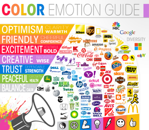
Although colors can mean a different number of things and pull various perceptions because of experiences, they do all sort of fall into a general category. They enhance or change the mood that someone may be in.
Certain colors are also the standard and accepted in various industries. So it’s important to pay attention to how you brand yourself and place colors on your website, blog, newsletters, and signature, before you rub your customers the wrong way.
 Check out this infographic from The Logo Company.
It’s also important to pay attention to how many colors you use on your site. Have an appropriate color scheme consisting of no more than three colors. More than that and you just have a busy website.
- Green is an earthly color and helps people relax. It also is the color of money so people start to think of wealth and prosperity. Think BP, John Deere, Land Rover.
- Blue is comforting and trusting. People instantly want to communicate. A very expressive color, look at Twitter, Facebook, and LinkedIn. Do you notice the pattern?
- Red is an attention grabber. It creates a sense of urgency. It is a very emotional color. It’s extremely popular in the food industry. Check out these popular logos: McDonalds, Coca Cola, and Nabisco. Lego and Nintendo also have red brands, they speak easily to children – “Hey, buy me”!
- Yellow is very optimistic. This bright color is an attention grabber. I can think of Ikea, Denny’s, and Best Buy.
- Pink is very feminine and romantic. This is great if you are targeting a young female market
- Black is powerful and dominating. This color speaks luxury to people. Hence, the black card.
- Purple is calming, royal, and sophisticated. Think Crown Royal, Hallmark, and Welch’s.
- Orange is an aggressive color. It sticks out and says there is something important here. FireFox and Discover Card ring a bell.
Are you looking for a way to create your own color scheme? Check out Adobe Kuler, a fabulous color wheel of which you can mix and max colors to create the perfect one for you. Once you are done, it gives you the RGB and HEX color codes. Want to get more insight to branding and logo colors?
Image courtesy of by Luigi diamanti / FreeDigitalPhotos.net
Color Emotion Guide Infograph: http://thelogocompany.net/

I love this! I’m in the process of getting my website redone and my web designer shared with me something similar. It was great to see, because honestly I had no clue. Thanks for the tips. Diana Ennen
The first question my logo designer asked me was about my colors. I had no clue. She said, WAIT! Just let me send you a link. That’s when I first discovered the importance of color selection.
I just love the colour purple so I made my whole website match that colour. Now that I know what it all means, it works so perfectly with everything I do
Thank you so much for this post – I really enjoyed it!
Oh you’re welcome Kelly. Purple just makes you feel fabulous!
Great post! Hits home where I am redesigning my website and looking at potential themes and colors this week! I’m leaning towards a grey/white background with teal and black lettering and my logo and accent colors are teal-green-blue. According to your info graphic you featured I am encompassing: balance, peaceful and trust… Perfect for encouraging health & wellness! Thanks for sharing, that makes me feel like I’m on track with my color choices!
Kristi,
I’m glad this post could help you out! It’s important to know the direction you need to go to avoid drastic changes later. Good luck!
Thank you for this post. Very interesting. I tend to use blue for just about everything I do because it promotes trust and I feel like it puts people at ease. 🙂
I must admit, blue is my favorite color!
Great information! I chose blue and green for my colors to show clients that they can count on me and I’ll help them make money. And blue’s my favorite color, so I never get tired of it!
I love blue. It really is a trusting color. Thanks for reading the post Janet!